For most people, first impressions matter and favorable first impressions on a website boost user interaction. A poor website design may damage your user’s expectations, and even worst, you can give them a wrong impression. Here are 9 crucial things designers consider when creating beautiful visual content:
1. Color palette
As you maybe have heard before, each color has a meaning and represents emotions, feelings, and even status, etc. You can add meaning, intention, and a tone to your website just by picking the right color, you just need to make sure you know very well the audience you’re designing for.
Tip: I highly recommend heading over to Dribbble for some colour palette inspiration or borrow any colour palette idea from Color Hunt or experiment your own palette with the help of a colour palette generator like Coolors or Adobe Kuler. But if you really want to be sure what colors look good together,
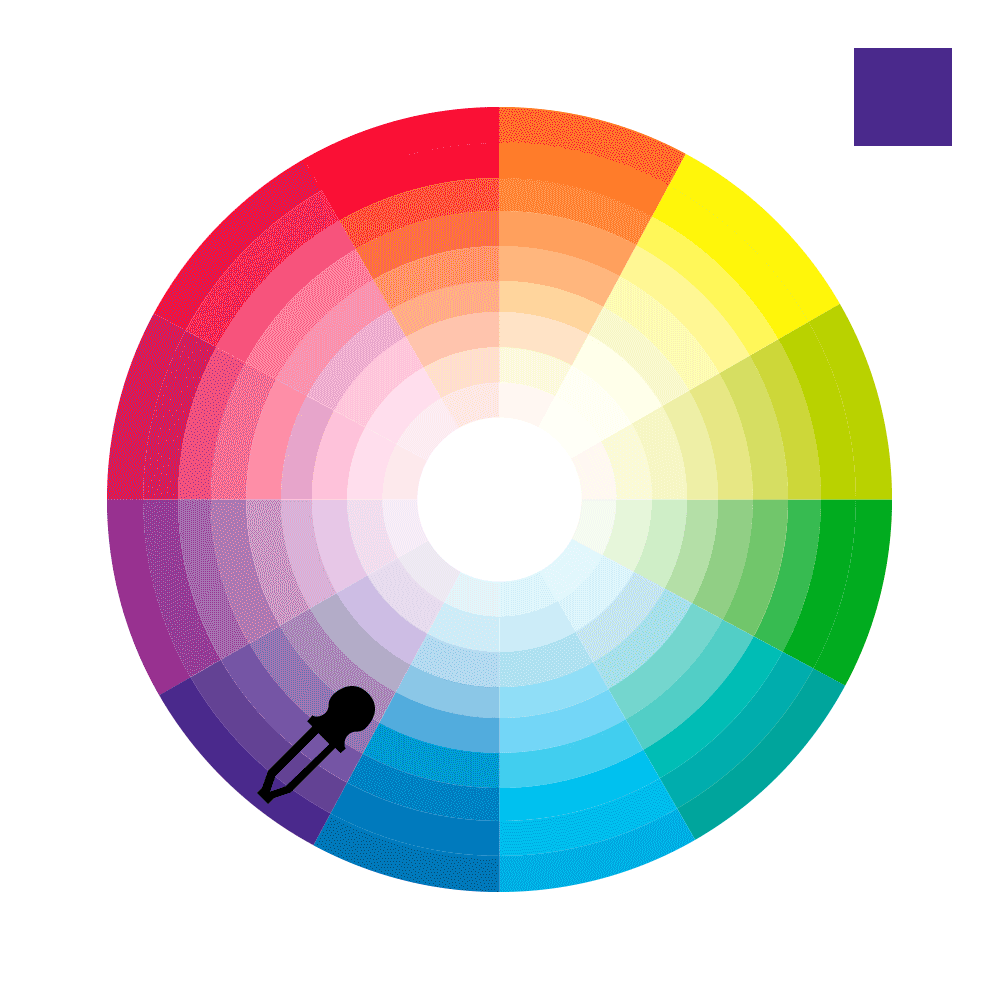
I recommend the Canva’s Color Wheel
2. Color contrast
In terms of colors, the background and font color should be different enough to not cause eyestrain. But be careful! Not all combinations of colors are suitable for use, and some color combinations may impact the readability for good or for bad.
Tip: Play safe contrasting dark and light colors, hue colours or colour intensity. And if you still not sure you can test your contrast combination with Colorable, a cool colour contrast testing tool.
3. Contrast and balance
Contrast is more than just opposites colors like black and white. Contrast can be achieved with the help of shapes, scales, typography, etc., to create a focus on specific elements or distinct elements from each other. Making some elements bigger or bolder than others or scaling some elements depending on its importance will help to create contrast and rhythm and lead your users’ eyes through your design effortlessly.
Tip: On a website, we can apply this theory to a link, crucial information, button, or any element we want to make stand out as more important.

4. Choose the right Typeface
Having the perfect typeface can help you achieve the right tone of the message. So how well you choose the fonts has a significant influence both on the attractiveness of your design and the clearness of the message. The first rule of typography is that it must be legible and readable. This means that as long as the typeface is clean and easy to read, you’re ok. It’s important that the mood or personality of your typeface matches with the design and the purpose.
Tip: The fancy or unique typefaces with a strong personality are best when you want a word or phrase to really stand out, rather than using them for paragraphs of text, where they’re hard to read.

5. Limit the typefaces to 2 or maximum 3
Learning how to choose fonts that harmonize well together can be a tricky task, it requires experience, practice, and intuition. So play safe on this stage, because if two typefaces clash, this can get confusing for your readers and might distract from your real message. So just keep it simple!
Tip: My best recommendation is to use 2 matching typefaces. Use a maximum of 3 typefaces in a maximum of 3 point sizes, but no more than that.

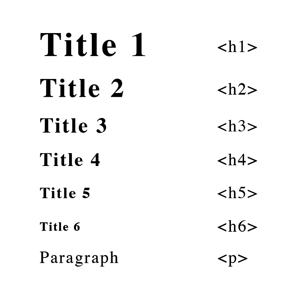
6. Structure your text
Using hierarchy to organize your content is not only good for the SEO but also for the reading flow. When you use the Headings, Subtitles, and Body text in the right way with the proper size, from bigger to smaller, this will create good contrast and balance. So try to make your titles short and concise with big font size, then subtitles (if necessary to give a little more information) with smaller font size, and then the paragraphs with an even smaller font size but with a comfortable size to read a long piece of text. It’s all about making the size serve a purpose.
Tip: for the best visual comfort, consider the size of your text of around 14px to 16px and not less than 12px.
7. Layout structure
Remember, users don’t read your site, they scan it, so the less crowded your information is the better. Most web users scan pages from left to the right, from top to bottom in an F pattern or Z pattern. So, make your layout easy to scan, and use visuals to help break up blocks of text, and attract the user’s eye.
Tip: Place the important information on the main focal points and be consistent through all your website using same or similar layouts to make a strong user pattern.
8. Alignment and grid
When you don’t follow any “grid” at all, you may be facing the issue of misalignment. Even if you’re making an “Out-of-the-grid” design on purpose, there must be an order for that design. Alignment is especially important with text, and following a grid will structure your design and make it more pleasant and easier to digest.
Tip: Fixing alignment on text and images is one of the easiest improvements you can make to your website and instantly makes it look more professional.
9. Whitespace
Whitespace is the space between the elements on a page, but it doesn’t need to be white, it is just empty space. It declutters your website and makes your elements breathe. I know it can be tempting to cram in as much stuff and information as you can into a page to fill any single empty space, but actually, whitespace helps people flow through your content and understand the message you are trying to convey better. It’s also more likely to attract attention than a cluttered composition.
Tip: Apply uniform spaces around text boxes, images, and other graphic elements to make your design easier to read.
So, keep it simple and make sure every element has a reason to be in the design. Also, make sure to choose the right colors, that the contrast is enough, the text is legible, the elements are correctly aligned, and space is giving design elements enough room to breathe. With these design tips, your website will not only look good but also it will be easy to understand.